(1-6 left - right)
The first still shows the voodoo doll which is heavily featured in the video perched amount some plants and a flow of water pouring out next to the doll but not quite reaching the voodoo doll. The reason I did this was due to the lyrics at that point in the song. The lyrics state 'Holy water cannot save you now'. I made use of the voodoo doll because a voodoo doll is known to represent the evil within magic as in many cases on TV or in film a voodoo doll is seen hanging or placed near someone who is being controlled by the voodoo doll. The person copies the movements of the voodoo doll; for example, if someone is connected to a voodoo doll, and the person who has initiated the connection stabs the dolls arm, the person in question would feel the same stabbing pain on their arm. Due to this notion, in popular culture, the voodoo doll is seen as a sign of control, generally seen being 'summoned' or used by a character wanting to inflict pain. To show that the water is in fact holy, the next scene on screen shows a religious figure with a candle lighting the presence of the figure.
The Second still shows a river with the lead artist singing over the river. This shows the river flowing with a tinted colour filter. The filter was to enhance the essence of dark magic centred around my lead artist. My artists face in the middle of the stream shows the sheer amount of control the artist possess over the other character (her good side) and how the strength of the flow of the river cannot stop her from achieving what she wants. Another reason for this shot was the accompanying lyric which states 'and no rivers and no lakes can put the fire out' which also leads on to the next scene and the still seen here.
The Third still leads on from the previous still as the lyric is the same but more to reference the latter half of the lyric stating 'put the fire out' hence the reason for the candle overlaying the river and not the other way around. The candle over the river shows the power of the candle over the water when in actual reality, water would extinguish the fire. The fact that the candle has out powered the river, once again shows the sheer strength 'evil Paige' has over the better/ non evil self. The light from the candle also takes over the entire screen to show the power of fire when ignited with dark magic.
The Fourth still shows the evil side to my lead artist poised in beginnings of performing a ritual. The mis en scen shows the voodoo doll leaning against a black cauldron. The reason for the cauldron was to highlight the uses of magic in popular TV programmes and Films. The candle next to the other two items is also regularly seen around witch craft and rituals in the media today. The chalk on the floor is actually a pentragram which is a well known symbol associated with witch craft. The scene shows Paige picking up two crystals which are also widely used with rituals in around popular media. The Crystals used were of a specific colour, I found the types required through researching on websites and forums dedicated to witch craft. All of this combined together is to illustrate the lyric behind this scene which states ' I'm going to raise the stakes I'm going to burn you out' the raising of the stakes is raising the crystals (picking them up).
The Fifth still shows a crystal light with colour changing lamps. Hanging off one of the lamps is a skellington. The skellington is not clearly seen but can be seen over ever so slightly in front of the purple lamp. The reason for the purple lamp with the skellington is because the crystal used is also purple. The lyric coupled with this scene states 'I'll be dead before the day is done'.
The Sixth still here shows Paige drawing blood from her finger in order to complete the ritual. The inspiration for this aspect came from a TV show called 'The Secret Circle' in which blood was drawn to start a memory spell. The reason for placing this footage here was because of the lyrics stating 'all your love will be exorcised'. Drawing blood would be a form of exorcism, however instead of a battle against evil, this exorcism would be used to assist the evil in ridding the good.
The use of lyrics to inspire the footage seen is also present in real media texts such as this new video.


( 1-3 Left - Right)
The First still shows an upward tilt showing the length and size of the vase and the leaves in the vase. At this point in the song, the instrumental begins to lead toward a crushendo. At this point in the track, flutes and breakables can be heard starting out quiet leading to more volume coming from the hi-hats. This movement justifies the music as the camera moves along with the music.
The Second still shown here shows two voodoo dolls with a ref filter. The colour red is to portray the evil within the dolls. This shot shows the doll taking control as there are two dolls which lead to more power. The pitch of the music at this point decreases by 4 notes on the music scale. The lower pitch of the music further references the dark magic as lower registers are usually in use to accompany dark defying atmospheres. The scene changes in time to the snare of the drum in the song, the effect of the visual changing in time to the beat further enhances the effect it has on the consumer.
The Third still is from the ritual carried out, during this section of the song there are lyrics present, however, the reason for using this represent music and visuals is because Paige moves her hands in time to the beat of the song. This enhances the effect and atmosphere surrounding the ritual. The movements and beat working together provide more entertainment for the enjoyment of the consumer of the products.
The use of the beat within a song when editing a video has been used many times before. An example of this would be the video for the song 'Elastic Heart' by Sia
At 2:34 in this video, the angle of the shot changes when the beat can be heard, this enhances the effect of the choreography.
Genre Specific Visuals
The orginial artist - Florence and The Machine can be defined as alternative (as classified by ITunes). Within the genre of alternative there can be many sub-genres, going from the sound of her voice and the tempo of her songs I thought Florence in terms of genre would fit in between Evanescence, Marina And The Diamonds and Birdy.
Below are music videos from those three artists.

The Second set of stills show a scene from the video for Wings by Birdy. As you can see the shots are very similar with the sun shinning through the trees. The difference lies with the extras in shot. In the video of Wings, someone can be seen doing a somersault whereas with mine, you can simply see the sun breaking through the trees.
This last set of stills show the effects of playing with different lighting. This still comes from Immortal by Marina and The Diamonds. As seen, light also plays a large factor in my music video with light reflecting next to a metal skull. I achieved this effect by placing a torch behind a transparent vase made out glass.
Close ups of the Lead

The first shows Paige singing in a profile shot. In this close up, only parts of her face can be seen this is because I wanted the majority of the video to show the ambiguity of not knowing who the person after 'Good Paige' was.
The second still shows her entire face and can be seen during the chorus. The reason for only showing her face during the chorus was because it was here where her 'Good side' is seen mainly due to the lyrics stating 'Seven Devils all around you'. The only construction in the way of seeing her face is the plant in front of her.
The third still shows a shot that is featured quite regularly. This too is a close up and comes in short bursts throughout the video and is finally seen in full at the end.
The close ups here show Paige as quite an interesting or mysterious character, this helps to market Paige as a brand by suggesting she is more part of a subculture than mainstream life or mainstream music. With the music of the current day, having an artist who is seen as more 'mysterious' keeps the consumers wanting more and therefore the companies behind Paige can market her to a better extent.
With the original artist, Florence and The Machine, Florence herself also as close ups in music videos.
The following showcase some close ups, the songs are as follows, Shake it out, Dog Days Are Over and No Light No Light

The stills to the left are from the above videos. The first still shows Florence mid song during 'Shake It Out'. The second still shows Florence looking down during the video for their song 'No Light No Light' and the third shows a still of a close up from their song 'Dog Days Are Over'.
In all videos referenced of Florence And The Machine and in my media creation, the lead artist is the main focus. In my video, 'Paige' is the only person seen in the video, no one else is seen at any point. In the reference videos of Florence, there are other people seen but she is the main person to be seen in the video.
Inter-textual references
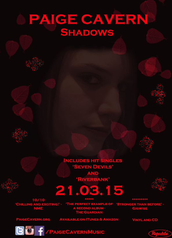
Within my video, there are no inter-textual references to any other song or video or item. The entire video is contained within itself. The references are conventions of music videos however, I have not followed them for certain reasons. I did not want this video to be a link to something else as this song on the album is listed as a cover of Florence and The Machine because Paige is said to be heavily influenced by the Florence and The Machine.