What have you learnt from your audience feedback?
Digi-pak
 This is the first draft of my digipak with my own pictures. I was advised by my peers to either make all writing white or make all writing red to ensure there is continuation with the theme of red and black as the main colours. prior to this, my disk tray was of a crystal ball. However, a peer suggested changing this because the crystal ball looked more like tin foil as the entire crystal ball could not be seen. I was also advised by another peer to edit the front panel to make it look bigger as it currently looks like there is a boarder of some sort around my artists' face. I took the advice received on board.
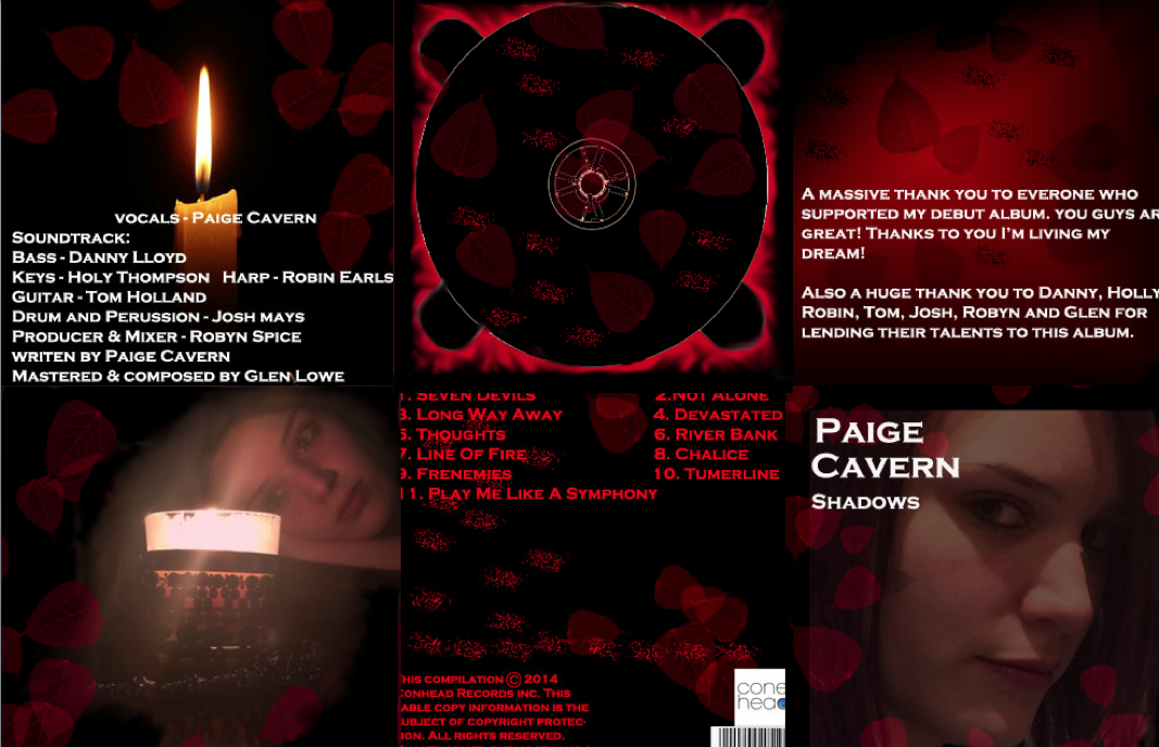
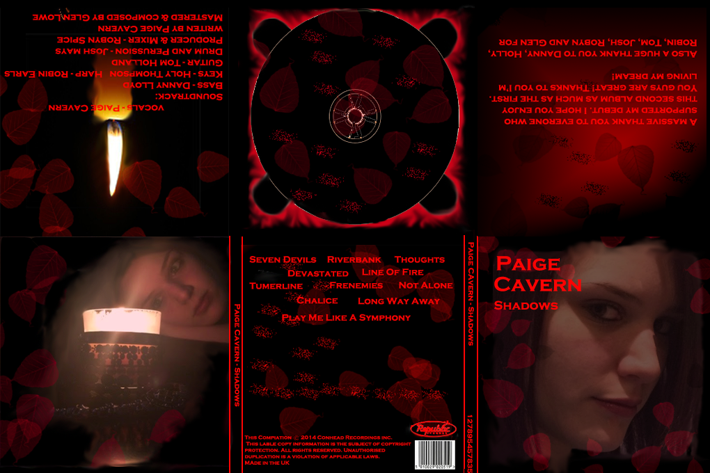 This is another version of my digi pak. Here I have changed the colour of the text to ensure there is a clear colour scheme of red and black. I also changed the positioning of the tracklist on the rear panel. In terms of my front panel I discarded the boarder around my artists' face. A piece of advice was a change I had overlooked. I had changed the label from ConeHead to Republic, but had not changed the copyright notice from ConeHead to Republic.
 This is the result of the changes made through the pieces of advice received. I have changed the front panel to make the look more consistent with the rest of the digipak. I smoothed over the edges and included in the red specs seen on the other panels. I also included the red specs on the two panels furthest to the left, to continue with the theme. Looking through the previous versions of my digi-pak I find I have made the appropriate changes to incorporate the themes I wanted.
Magazine Ad/Poster:
 This is the Magazine Advert/poster I created originally, it consists of the same picture as the front panel of the digi-pak. The feedback I received was to change the colour to either show white text and white leaves or to have red text and red leaves to continue with consistency with the music video and the digipak. Another piece of advice was to change the release date to a numerical form to ensure someone would catch the release date when walking past.
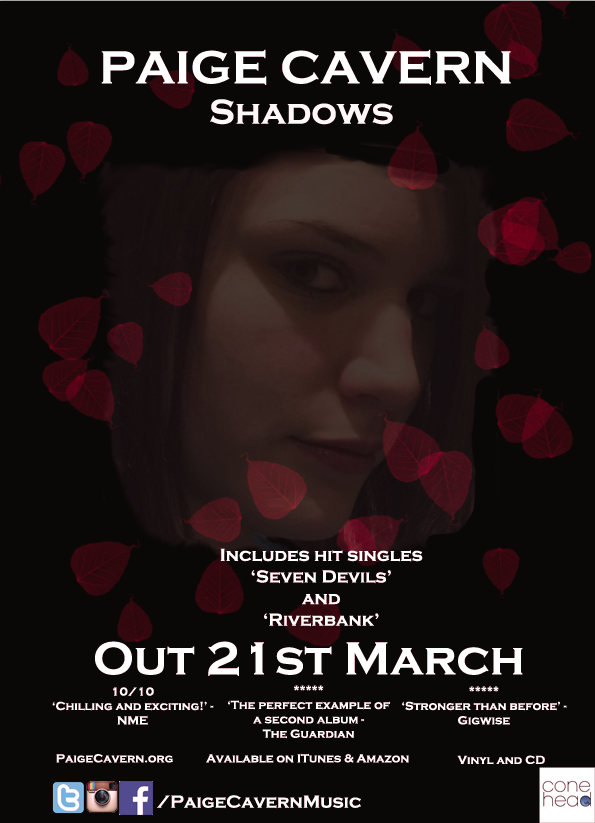
This is the second draft of my poster. Here I have changed the colour scheme of the poster for it to be black and red in keeping with the digipak and ambiance of the music video. I also changed the date to a numerical form as advised by a peer. For this version, the feedback I received was to smooth over the edges of my artists face as the outer edge is very rough. Also to include some red specs to ensure consistency with the digipak as the front panel is the same as the main image for this poster.
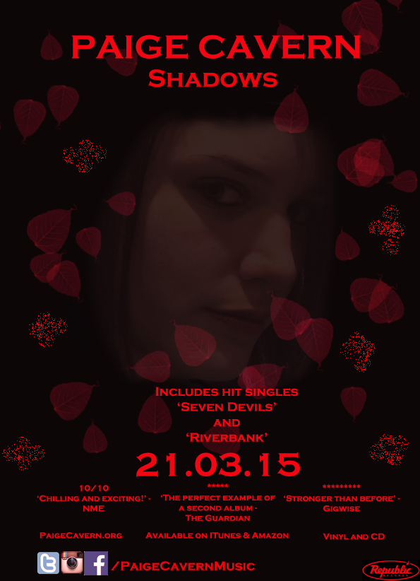 This is the final version of my magazine advert/poster. As you can see I have taken on all feedback received to improve my poster/magazine advert. I used photoshop to smooth over the edges of artists face and I have included the red specs around the leaves in keeping with the theme and layout/look of the digipak. This has been done in keeping with the ambiance of the music video. I feel this version has best layout/design and is in keeping with the other products.
Video
This is a version of my music video. I've had to use the in YouTube editor due to final cut changing the coding during export leaving the image to appear washed out. In terms of improvements, I was advised to add in more quick 1 second shots of the singer and to ensure fewer shots of the pentagram as it was said appear too many times and therefore was not as effective. As well as this I was advised to include more of the lip sync and to also soften the lip sync with the side profile as the edges around my artists face were fairly rough. On the topic of colouring, I was told there is possibly too much colour with the night scenes being blue jumping to orange/red infused ritualistic scenes, the change was a bit too much and didn't quite sit well.
This is another version where I have made said amendments. In addition I was advised to change the ending with the two lip syncs to a shot of the singer finally making eye contact to ensure full ambiance. I was also advised change the footage with the spiders to something else as they did not properly fit in with the rest of the video. Furthermore, I was told to edit to the beat as some parts are simply a mili-second off beat. However, I did not change the colouring to make the changes smoother as the comment suggested the colours didn't sit well and made it slightly confusing to watch - this is something I was aiming to achieve with this video and therefore I have not changed the colouring!
This is the final copy of my video. As advised to, I have changed the ending to show the final shot being of the artist finally making eye contact with the viewers. In place of the spiders I have included more of a lip sync and more iconography and edited the song more to the beat. This is the feedback I received for this video:


In response to the suggestion for smoother transitions, the reason for rough jump cuts is to make the viewer somewhat uncomfortable about the essence of the video.
No comments:
Post a Comment